A new page, a reworded policy, a menu entry for the Ramadan drop: on most shops these
all wait in a developer's queue, and the moment passes before the change goes live. This chapter is
about doing it yourself. You build pages from ready-made blocks, arrange them by drag and drop,
preview, and publish in both languages the same day the idea arrives.
The problem: the idea for a page arrives today (a Ramadan lookbook,
a "Story of Our Craft"), but turning it into a live page normally means briefing a developer and
waiting, and by the time it is up the moment has passed.
Build any content page yourself out of ready-made building blocks: stack them, drag
them into order, and fill in your words and images in both languages. A page stays a
Draft while you work, completely invisible to shoppers, and goes live only when you
switch it to Published, so a half-finished page never shows.
In practice
Say you are launching a "The Story of Our Craft" page to explain where your
fabrics are sourced and how the embroidery is done, with a hero image, a few paragraphs, and a button
that leads to the ready-to-wear collection.
How Angelite handles it: you open Content then Pages, click Create page, and give
it a title and web address in both English and Arabic. You stack a hero block, a couple of text
blocks and a button block, dragging each into order by its grip handle, and type the words for each
language. You leave the page as a Draft while you polish it, preview it, then flip it to Published
and save, and the page appears live on the storefront.
How to use it
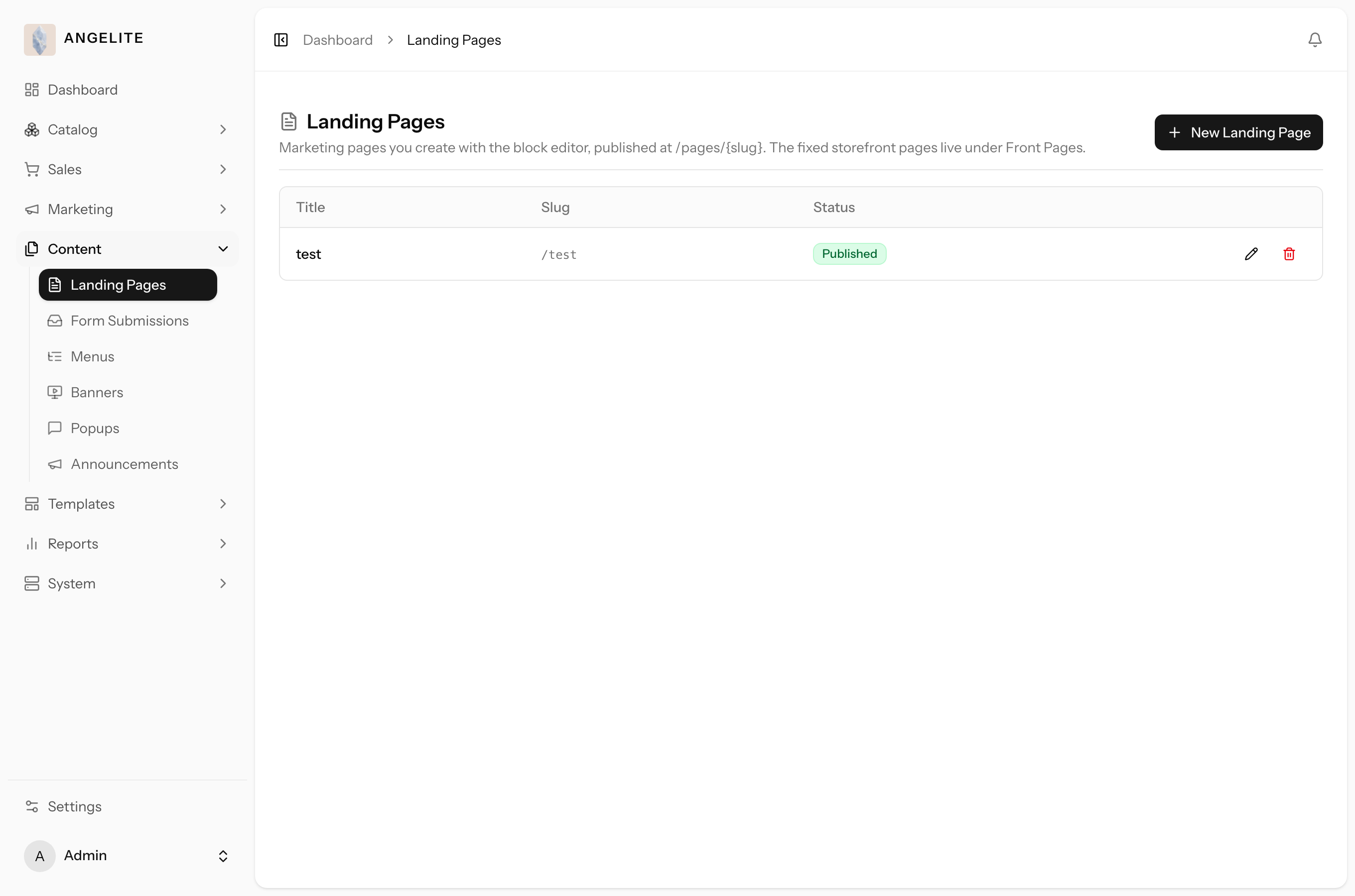
Open Content → Landing Pages to see all your pages and whether each is published.
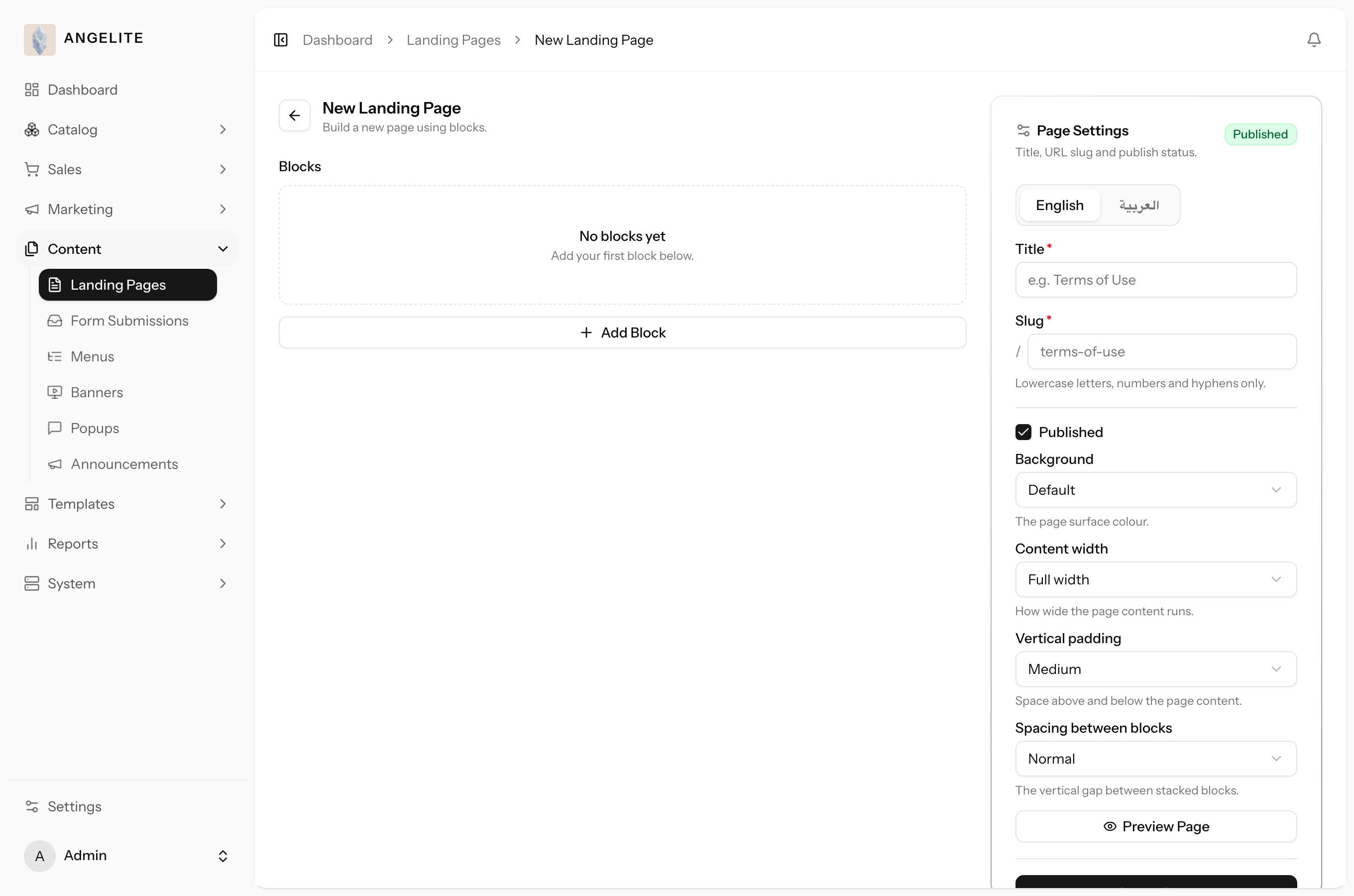
Click Create page, give it a title and a web address in each language.
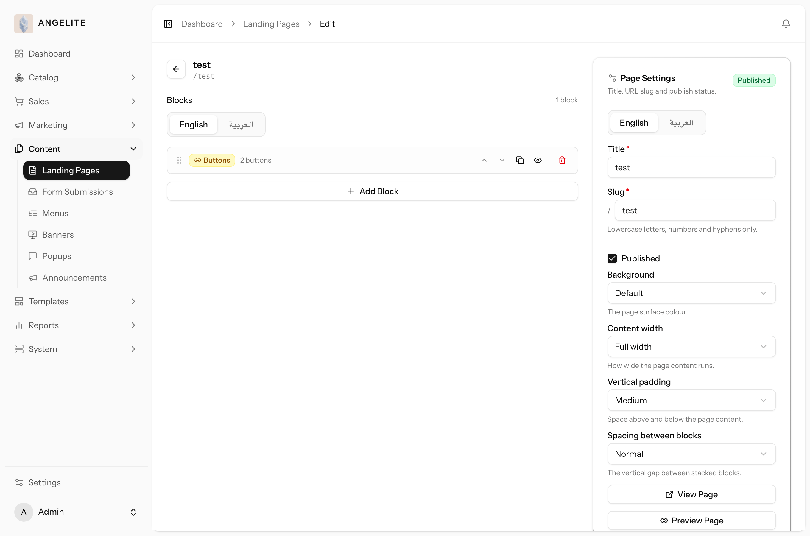
Add blocks (headings, text, images, buttons, and more), then drag them by the grip handle to reorder.
Fill in the words for each language, and adjust each block's look in its Appearance panel if you wish.
Switch the page to Published and save. The page is now live on the storefront.
Where: Content → Landing Pages. Each row shows the title, address and published state.Where: the new-page screen, where you set the title and address and start adding blocks.Where: the page editor, with the block list, the per-block fields, and the language tabs.
Your storefront pages are built from blocks for one simple reason: it puts the layout of
your shop entirely in your hands. Instead of asking a developer to write code, you stack ready-made
sections (a hero banner, a row of cards, a gallery, a contact form) like building bricks, drag them
into the order you want, and fill in your own words and pictures. Every block is translated into each
of your languages and is automatically styled to match your brand colours, fonts and spacing, so a
page you assemble in minutes still looks designed and on-brand, in both English and Arabic.
Here is the full set of blocks you can stack on a page, and when each one earns its place:
Block
What it is
When to use it
Heading
A single title line, in a few sizes.
To label a section, for example "New Arrivals" or "Our Promise".
Text
A rich paragraph with bold, links and lists.
For your story, care notes, or any block of written copy.
Image
One picture, framed or plain, with a caption.
To show a single piece, a workshop shot, or a lifestyle photo.
Hero
A large banner with a background image, overlay heading and up to two buttons. You
can choose how the image is framed and positioned, dial the overlay darker or lighter for
readability, and let it run edge-to-edge (full bleed) instead of staying inside the page's margins.
At the top of a page, to make a strong first impression and lead shoppers somewhere; full
bleed for the most dramatic, magazine-style banners.
Call to action
A heading, short text and a button, as a card or banner.
To nudge a shopper toward one action, for example "Shop the gift edit".
Buttons
A row of one or more buttons.
To offer a few clear choices side by side.
Products
A row or carousel of products, either hand-picked by you or pulled
automatically (the newest arrivals, your best sellers, everything in one collection or category, or
whatever the shopper is currently browsing).
To spotlight a few pieces, or to keep a "New
in" or "Best sellers" row current on its own without you updating it by hand.
Cards
A grid of small cards, each with an image or an icon (pick from a ready icon set,
or upload your own), title and text.
To highlight services, categories or destinations in a
neat grid.
Category & collection grid
A grid of your categories or collections, each shown as
a card with its own image.
For a "Shop by category" or "Explore our collections" section on
the home page.
Features
A grid of short items, each with an icon and a line of text.
To list selling points, for example "Free gift wrap", "Free alterations".
Gallery
A grid of images, with the gap between them, a click-to-enlarge lightbox, and
captions each switchable on or off.
For a lookbook or a set of detail shots a shopper can click through.
Two column
An image beside a heading and text.
To pair a photo with a paragraph, for example a designer profile.
Image collage
Two overlapping images beside a text column (a heading, a decorative
number, rich text and a divider).
For an editorial-style "our story" or "our craft" moment
that feels more considered than a plain image-and-text block.
Quote
A styled quotation with an attribution.
To feature a founder line or a press mention.
Testimonials
Customer quotes in a grid or a slider.
To build trust with reviews from real buyers.
Accordion
Collapsible titled panels of rich text.
For details, policies or how-it-works steps that should stay tidy.
FAQ
A list of question-and-answer pairs that expand.
For a focused questions page, for example sizing or shipping queries.
Video
An embedded YouTube or Vimeo clip.
To show a craftsmanship film or a styling reel.
Form
A form with text fields and dropdowns you define.
To collect enquiries, bespoke requests or appointment bookings into an inbox.
Stone sequence
A full-width hero where frames play as the page scrolls.
For a signature, eye-catching rotating-stone moment.
Alert
A coloured notice (information, success, warning).
To flag something important, for example a holiday delivery cut-off.
Separator
A simple divider line.
To break a long page into clear sections.
Spacer
An adjustable empty gap.
To add breathing room between blocks.
Columns
A container that holds other blocks side by side.
To place blocks in two or three columns for a richer layout.
Filter sidebar
A panel shoppers use to narrow products (on listing pages).
On a shop or category layout, so shoppers can filter by fabric, size or price.
Product grid
A paginated grid of products (on listing pages).
Paired with the filter sidebar, to list the matching products.
Tip: keep a page as a Draft while you prepare it; nothing reaches shoppers
until you publish. Blocks start collapsed so a long page stays easy to scan.
Tip: every block, and every repeated item inside one (a card, a
testimonial, an FAQ entry, a form field, a gallery photo, a button), has a one-click
Duplicate. Use it to copy something that is almost right and just tweak the copy,
rather than rebuilding it from scratch.
Front pages, layouts & legal pages
Admin
The problem: a policy change or a new boutique phone number should
be a two-minute edit, but when the home page, the legal pages and the shared layouts each live
somewhere different, you hunt for the right place and hope you caught every copy.
One place to edit every fixed part of your storefront, grouped into three kinds: your
storefront pages (home, about, contact), the shared layouts that shape the shop listing and every
product, category and collection page, and the legal pages (privacy policy, terms of use, cookie
policy, returns and shipping). None of these can be accidentally deleted, and a change made here
lands everywhere it applies, using the same blocks as any other page.
In practice
Imagine Qatar's delivery rules change and you need to update your shipping policy
and refresh the contact page with a new boutique phone number, and separately you want every
product page to show its reviews higher up the page, without hunting across different menus for
where each of those lives.
How Angelite handles it: you open Content then Front Pages, where your storefront
pages, your shared layouts and your legal pages all sit together, grouped by kind. You click the
shipping policy, edit the text in both languages in the same block editor you already know, and
save. You then click the contact page, update the phone number, and save. Separately, you open the
Product layout, drag the reviews block higher up, and save, and every single product page updates
to match immediately, since they all share this one layout.
How to use it
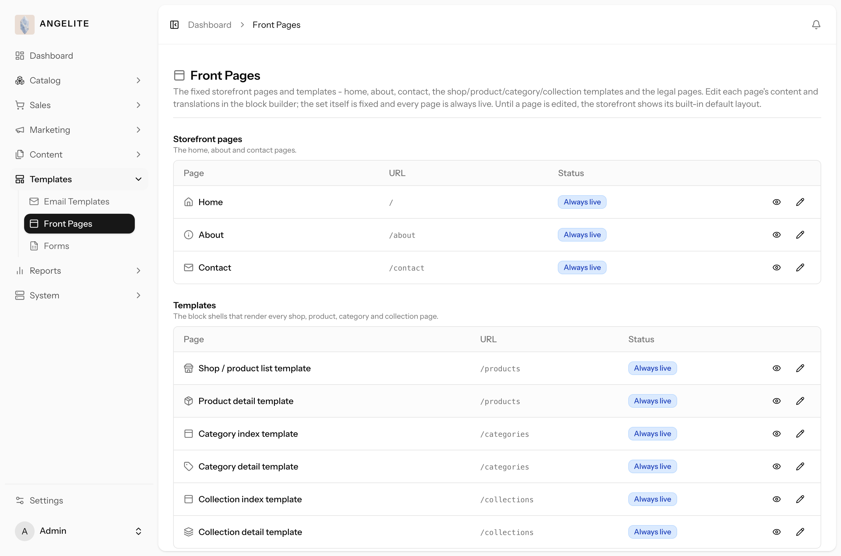
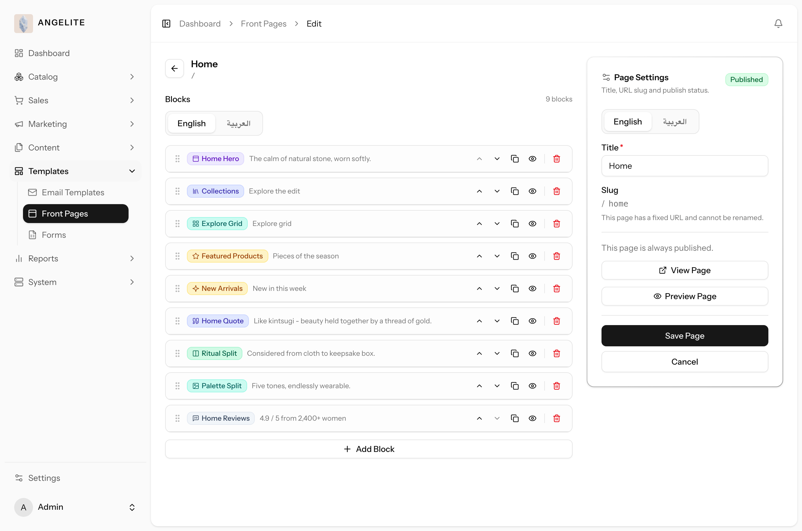
Open Templates → Front Pages to see your storefront pages, layouts and legal pages together.
Click the one you want to change to open it in the block editor.
Edit the words and images, add or reorder blocks, and fill in each language.
Save. The change goes live straight away, everywhere that page or layout is used.
Where: Templates → Front Pages, grouped into storefront pages, layouts and legal pages.Where: editing the home page, built from the same blocks as any other page.
Good to know: the legal pages live at their own tidy web addresses and are
wired into the footer automatically, so shoppers can always find them. This is separate from
Content → Landing Pages, which is for pages you create yourself and can delete at any
time; see "Pages" earlier in this chapter.
Content blocks
One layout, every product (or category, or collection)
Admin
The problem: you want every product page to change (reviews higher
up, a "You may also like" row at the bottom), and you have 200 products. Editing them one by one is a
week of work, and the pages drift apart the moment you miss one.
Your shop listing and every product, category and collection page share one layout each,
built from the same drag-and-drop blocks as any other page (this is the "layouts" group inside Content
→ Front Pages). Instead of typing each product's name and photo into its own page, a block can be
pointed at "whatever the shopper is currently viewing", so the one layout automatically shows the right
name, photo and details for whichever product, category or collection someone opens. Change the layout
once and every page of that kind updates together.
In practice
Say you want every abaya's product page to show the photos and details, then a
reviews section, then a "You may also like" row, and you want that exact layout on all 200 products
without editing each one by hand.
How Angelite handles it: you open the Product layout once, add the blocks you want
in the order you want (a gallery block, a details block, a reviews block, a recommendations row), and
for the parts that should reflect whichever abaya someone is looking at, you point the block at
"the product's own photo" or "the product's own name" instead of typing something fixed. You save,
and every one of your 200 product pages instantly shows that same polished layout, each with its own
correct photos and details filled in automatically.
How to use it
Open Templates → Front Pages and pick a layout (Shop, Product, Category, or Collection).
Add and arrange the blocks that belong on that surface; the block palette only offers blocks that fit it.
For a block that should reflect the specific product, category or collection someone is viewing, point its content at that item's own field (its name, its photo) instead of typing fixed text.
Save. Every page of that kind updates immediately to the new layout.
Where: the same block editor, opened from Templates → Front Pages → a layout.
Good to know: the shop listing and category/collection pages also come
with a matching "browse all categories" and "browse all collections" layout, covered in Chapter 02.
Listing blocks
Admin
The problem: a shopper who knows exactly what she wants (black,
crepe, size M) still has to scroll your whole catalogue to find it, and every extra scroll is another
chance for her to give up and leave.
Two blocks built for product-listing pages: a filter sidebar shoppers
use to narrow the products down (by size, fabric, price and your other options), and a
product grid that lists the matching pieces with sorting and page numbers. Together
they let you compose your own shop and category pages where shoppers find the right piece in a few
clicks instead of an endless scroll.
In practice
A customer lands on your Abayas category wanting a black crepe abaya with hand-beaded
sleeves in size M, under QAR 800, and you want her to narrow the choices herself rather than scroll
endlessly.
How Angelite handles it: on the abayas listing layout you add the filter sidebar
block and choose the sections to show (fabric, embroidery detail, size, price), then add the product
grid block and set how many columns it uses. When you save, the page shows a filter panel beside the
product grid: she ticks crepe, hand-beaded, size M and a price range, and the grid instantly narrows
to just the matching abayas, which she can also sort.
How to use it
Open a listing template in Content → Landing Pages.
Add the filter sidebar block and choose which filter sections to show (or show them all).
Add the product grid block and set how many columns it uses.
Save. The page now shows a grid shoppers can filter, sort and page through.
Where: the page editor, adding the filter and grid blocks to a listing template.
Stone-sequence block
Admin
The problem: the big fashion houses open their home pages with a
cinematic moment; for a boutique, that usually means video production and a developer, so your home
page stays a still image.
A striking full-width opening where a series of photos plays as the shopper scrolls,
like slowly turning the piece in your hands. You lay your own words over it (a small opening line, a
headline, a short body) and up to two buttons, and get a signature, editorial-grade moment with no
video production and no developer.
In practice
Imagine you photographed a made-to-order kaftan's hand-beaded sleeve turning slowly
on a mannequin, frame by frame, and you want the top of your home page to make that embroidery appear
to rotate as visitors scroll, with a headline and a "Discover the collection" button over it.
How Angelite handles it: you add the stone-sequence block to the page and upload the
whole set of frames in one go; they are kept in order and shown one after another as the page
scrolls. You write the opening line, headline and body, set the button label and link, and choose how
much scrolling the effect spans. On save, the home page opens with the embroidery turning smoothly
under your words as the shopper scrolls.
How to use it
Add the stone-sequence block to a page in Content → Landing Pages.
Upload the whole set of frames in one go; they are kept in order and shown one after another as the page scrolls.
Write the overlay heading and copy, and set the button labels and links.
Choose how much scrolling the effect spans, then save.
Where: the page editor, uploading and arranging the image frames.
Tip: the frames play purely from scrolling, so a sequence of evenly framed
photos gives the cleanest rotation. With up to 100 frames, they are shown as a compact thumbnail grid
you can scan and reorder at a glance, rather than one long list.
Editorial story blocks
Admin
The problem: a boutique brand lives on magazine-style storytelling,
but every editorial section (a full-page statement, an artfully overlapped pair of photos) normally
means briefing a designer and waiting for the layout to come back.
Three ready-made storytelling blocks that give a page that considered, editorial feel.
Statement lays a bold line of your own words across a full-width background image,
with a soft wash for readability, a choice of heading style, and an optional button.
Feature split places a full-width image beside a solid text panel, with the image on
whichever side you choose. Image collage overlaps two photographs beside a text
column with a decorative numeral and rich text, for an "our story" moment that feels art-directed
rather than assembled.
In practice
Say you are building an "Our atelier" page and want it to read like a magazine
feature: a full-width statement over a photograph of the workshop, then the story of your fabric
sourcing beside a close-up of the embroidery, then a closing spread of two overlapping photos.
How Angelite handles it: you add a statement block, upload the workshop photo and
type the line you want over it, softening the image with the built-in wash so the words stay
readable. Below it, a feature split pairs the embroidery close-up with your sourcing story on a
cream panel, image on the left. You close with an image collage: two overlapping photos, the
numeral "01" and a short reflection, written in both languages. The page reads like an editorial
spread, and no designer was involved.
How to use it
Add a Statement, Feature split or Image collage block to any page in Content → Landing Pages.
Upload the image (or the two, for the collage) and write your words in each language.
Pick the details: which side the image sits on, the panel colour, the wash over a statement image, the heading style.
Preview the block, then save.
Where: the page editor; the editorial blocks are added and arranged like any other block.
Cards block
Admin
The problem: you want your services presented side by side, but
hand-built sections drift uneven (one card longer, one shorter) and the page ends up looking homemade
instead of deliberate.
A tidy grid of content cards. Each card can hold an image or an icon, a title, a short
body, and an optional link, and the grid stays even and balanced no matter how many cards you add,
making it ideal for highlighting features, services or destinations.
In practice
Say you want your about page to present your three boutique services (made-to-order
tailoring, fabric sourcing, and complimentary hemming) as three neat, equal cards, each leading to a
page that explains it.
How Angelite handles it: you add the cards block, set it to three columns, and add a
card for each service with its image or icon, title and short description in both languages. You give
each card a link to its detail page, then save. The about page now shows the three services in a
clean, even grid that shoppers can click straight through.
How to use it
Add the cards block to a page and pick how many columns the grid uses.
Add each card with its image or icon, title and body, in each language.
Give a card a link if you want it to lead somewhere, then save.
Where: the page editor, building the grid of cards.
Good to know: for the icon, pick from the ready icon set or upload your
own image instead, for a fully on-brand mark; you can swap or remove an uploaded icon at any time.
Accordion block
Admin
The problem: the same three questions (sizing, fabric care, returns)
reach you again and again, but answering them all on the page risks a wall of text that scares
shoppers off before they read a word of it.
A collapsible list of titled panels. Each panel shows only its title until a shopper
clicks to expand it, so you can answer every recurring question right on the page while it stays calm
and easy to skim.
In practice
A customer browsing a ready-to-wear abaya keeps asking the same questions: how do I
find my size, how do I care for the fabric, and what is your return window? You want those answers on
the page without it becoming a wall of text.
How Angelite handles it: you add the accordion block and create a titled panel for
each question, typing its answer in both languages. You choose whether shoppers can open one panel at
a time or several at once, then save. On the storefront each question shows as a tidy collapsed row,
and tapping one expands just that answer, keeping the page calm and easy to skim.
How to use it
Add the accordion block to a page.
Add each panel with its title and its content, in each language.
Choose whether shoppers can open one panel at a time or several at once, then save.
Where: the page editor, adding the collapsible panels.
Forms & submissions
Admin
The problem: made-to-order requests arrive by Instagram message,
email and WhatsApp, and the important one is always the one that gets buried; by the time you find it,
the occasion it was for has passed.
Build a form once (its fields, its look, and who should be told when someone fills it
in), then drop it onto any page, or several, with a single Form block. Change the form once and every
page using it updates together. When a shopper submits, every entry is checked for completeness before
it reaches your inbox, lands in one structured, searchable list in the admin, and rings the bell in
your admin notifications; you can also have it emailed to specific people or sent to your connected
messaging channels.
In practice
Imagine you offer made-to-order abayas and want a "Request a custom design"
form where a customer describes the piece, picks a budget range and a fabric, and leaves contact
details and her measurements, with your design team alerted by email the moment one arrives, and you
want that same form on both a dedicated custom-orders page and a section of your homepage.
How Angelite handles it: you open Content then Forms and build the "Custom design
request" form once: a name box, an email box, a budget dropdown, a fabric dropdown, and a longer
description area, marking the required ones and choosing how it looks. In its notifications settings
you add your design team's email addresses so they are alerted the instant someone submits. You then
add a Form block to the custom-orders page and to the homepage and pick this same form on both, so a
change you later make to the fields updates everywhere it appears. When a customer submits, the entry
lands in your form submissions inbox and your design team gets the email alert as well as the admin bell.
How to use it
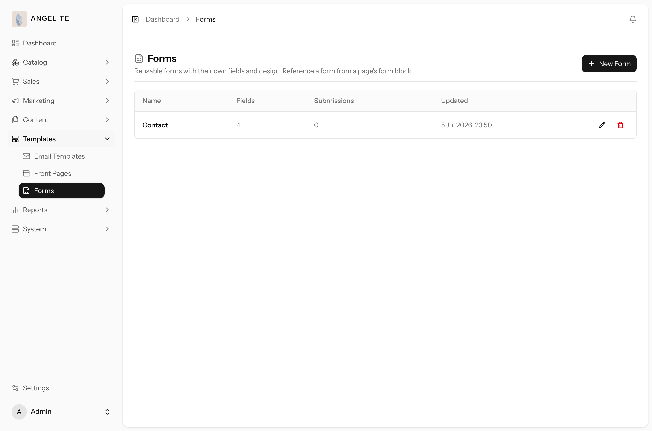
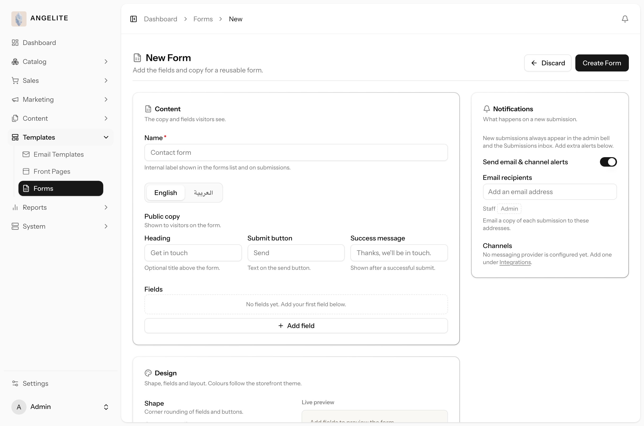
Open Templates → Forms and create a form: add fields (a text box, a longer text
area, or a dropdown with your own options), mark which are required, and choose its look.
In the form's notifications settings, choose who should be emailed and which messaging channels should be alerted on a submission.
On any page, add a Form block and pick this form; the same form can be reused on as many pages as you like.
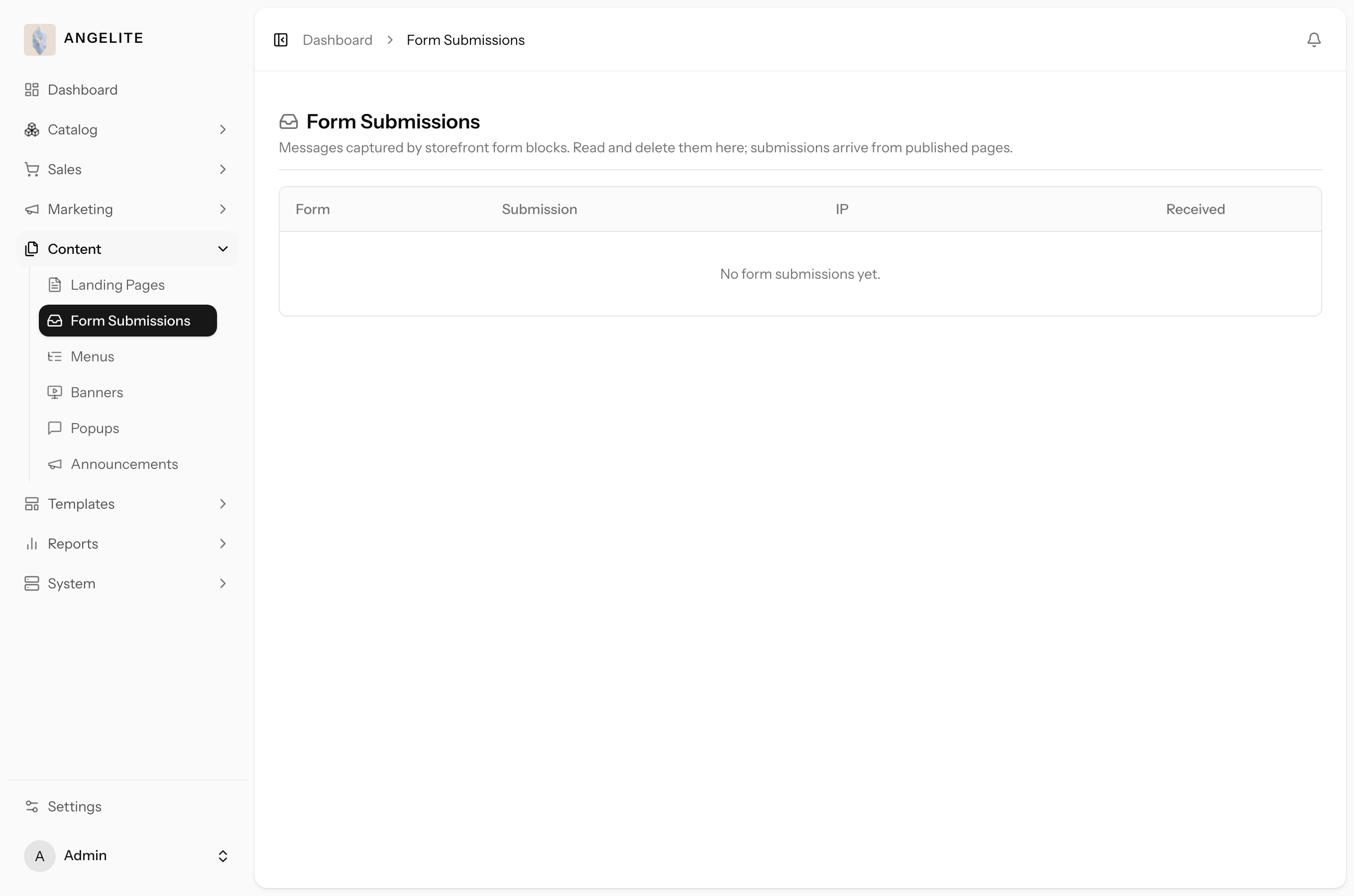
Read incoming entries in the form submissions inbox in the admin.
Where: Templates → Forms, where you design a reusable form.Where: the form designer, where fields and design are set.Where: the form submissions inbox, listing every entry shoppers have sent.
Built-in protection: every entry is checked for completeness and guarded
against spam before it reaches your inbox, so only genuine, complete entries land there.
Design controls on every block
Admin
The problem: the layout is right but the details are off, a face
cropped out of a banner, a section that feels cramped against the next one, and you should not need a
designer for that.
Nearly every block carries an Appearance panel with the finishing
controls: how the content aligns and how wide it sits, the background surface behind it, and its
height, up to filling the whole screen. Blocks with images add their own polish: a focal point
control so the important part of a photo stays in view however the screen trims it, and crop shapes
for a clean, consistent frame. Heroes can run edge to edge or stay neatly contained, and galleries
control their spacing, click-to-enlarge and captions.
In practice
Say your new hero banner looks perfect on your desktop, but on a phone the crop
cuts the model's face out of the photo, and the story section beneath it feels squeezed against the
product row that follows.
How Angelite handles it: you open the hero block and set the image's focal point
on the model's face, so every screen keeps her in frame however the photo is trimmed. Then you open
the story block's Appearance panel, give it more breathing room and a soft background tint so it
reads as its own moment. Two small adjustments, no designer, and the page looks finished on every
screen.
How to use it
Open any block in the page editor and find its Appearance panel beneath the content fields.
Set the layout (alignment, width, side padding), the background surface, and the height, including full screen for a dramatic opening.
On image blocks, set the focal point and a crop shape; on a hero, choose edge to edge or contained; on a gallery, set the spacing, click-to-enlarge and captions.
Preview the block, then save.
Where: the page editor; the Appearance panel sits at the bottom of each block's settings.
Preview before you publish
Admin
The problem: publishing blind, then refreshing the live shop to see
how the change came out, while customers are browsing that very page.
Every block has a preview button that renders it exactly as shoppers will see it, in
your real fonts, colours and spacing. A Preview Page button shows the whole page in
one view, including blocks you have not even saved yet, with or without the shop's header and footer
around it, so you sign off the page before a single shopper sees it.
In practice
Say you are rebuilding the home page for the Ramadan drop late in the evening,
and you want to be certain the new hero, the story section and the product rows hang together
before anything goes live.
How Angelite handles it: as you finish each block you click its preview button and
see it exactly as a shopper would. When the page is assembled you click Preview Page and read the
whole thing top to bottom, unsaved changes included, with the header and footer switched on to
judge it in context. Only when it looks right do you save and publish; the live shop never showed a
half-finished page.
How to use it
While editing, click a block's preview button to see that one block exactly as shoppers will.
Click Preview Page to view the whole page, including blocks you have not saved yet.
Switch the shop's header and footer on or off to judge the page in context.
Publish only when it looks right.
Where: the page editor; each block carries its own preview, and Preview Page sits with the page settings.
Navigation & performance
Page cache
Admin
The problem: a launch or a sale brings your busiest traffic of the
year, and that is exactly when a shop grinds slow; keeping it fast should not depend on you
remembering to refresh anything after every edit.
Speeds up your storefront pages by remembering their built-out content so they load
fast, even on your busiest day. The cache clears itself automatically when the underlying content
changes (you edit a page, a product, or a category), and you can clear it by hand at any time.
In practice
Say a shopper in Doha opens your home page on a busy sale day: you want it to appear
instantly rather than be rebuilt from scratch on every visit, yet you also want a price change you
just made to show right away.
How Angelite handles it: the page cache remembers each built-out page so it loads
fast for every visitor. When you edit that page, a product, or a category, the cache clears itself for
the affected content automatically, so the change appears on its own. For the rare moment you want a
change visible the very instant you make it, you open Settings then Page Cache and use the manual
flush to clear everything, a single page, or a single content type.
How to use it
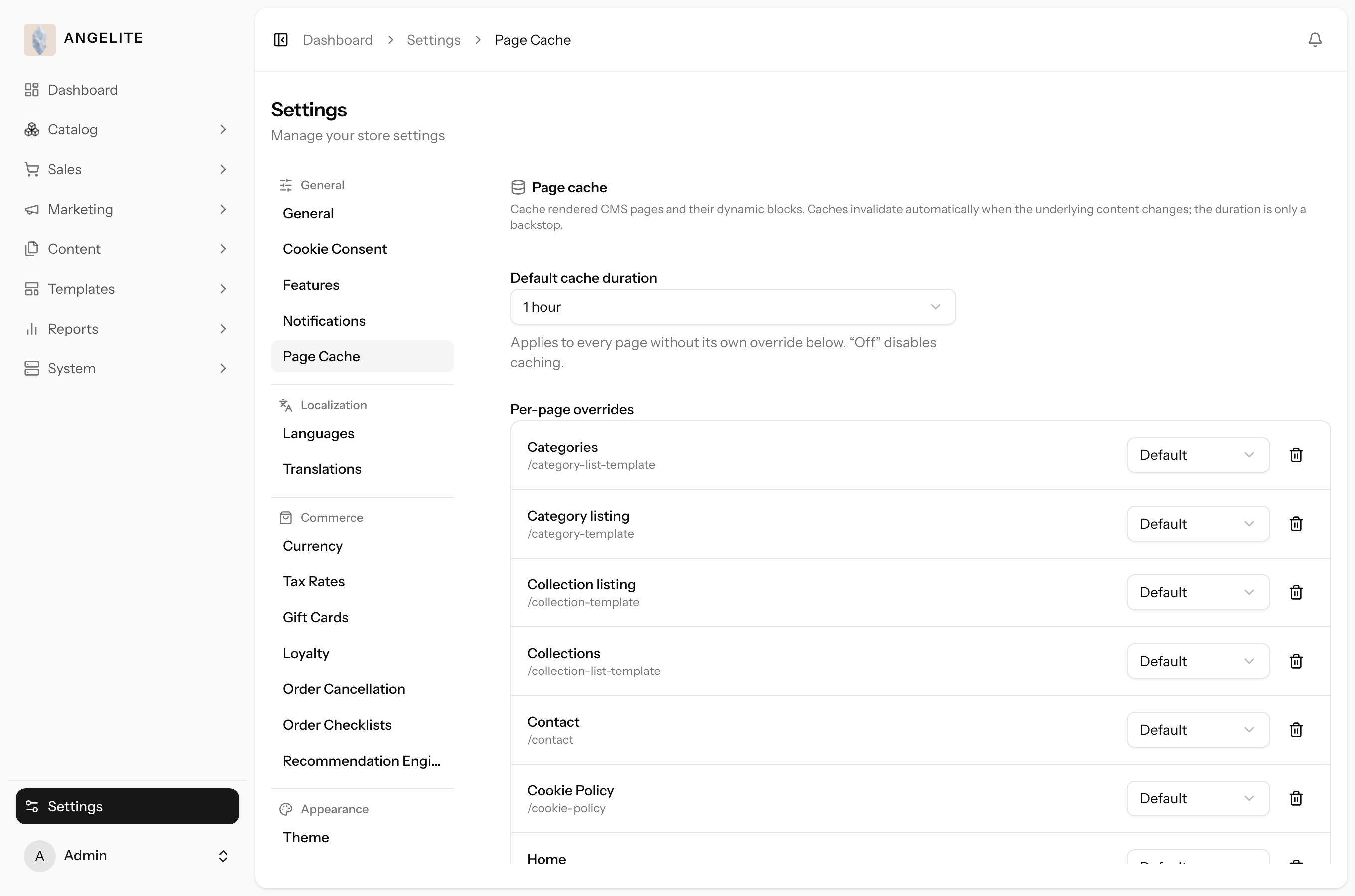
Open Settings → Page Cache.
Set how long pages are remembered (a default duration, with optional per-page overrides).
Use the manual flush to clear everything, a single page, or a single content type when you want changes to appear instantly.
Save. Your pages now load from the fast cache and refresh themselves as content changes.
Where: Settings → Page Cache, with the duration policy and the manual flush.
Good to know: the cache self-clears on most content edits, so the manual flush
is mainly there for the rare moment you want a change to show the instant you make it.
Menus
Admin
The problem: your navigation should change with the season, a
Ramadan entry under "Gifts", a new collection up front, but menu changes are usually developer work,
so they land late or not at all.
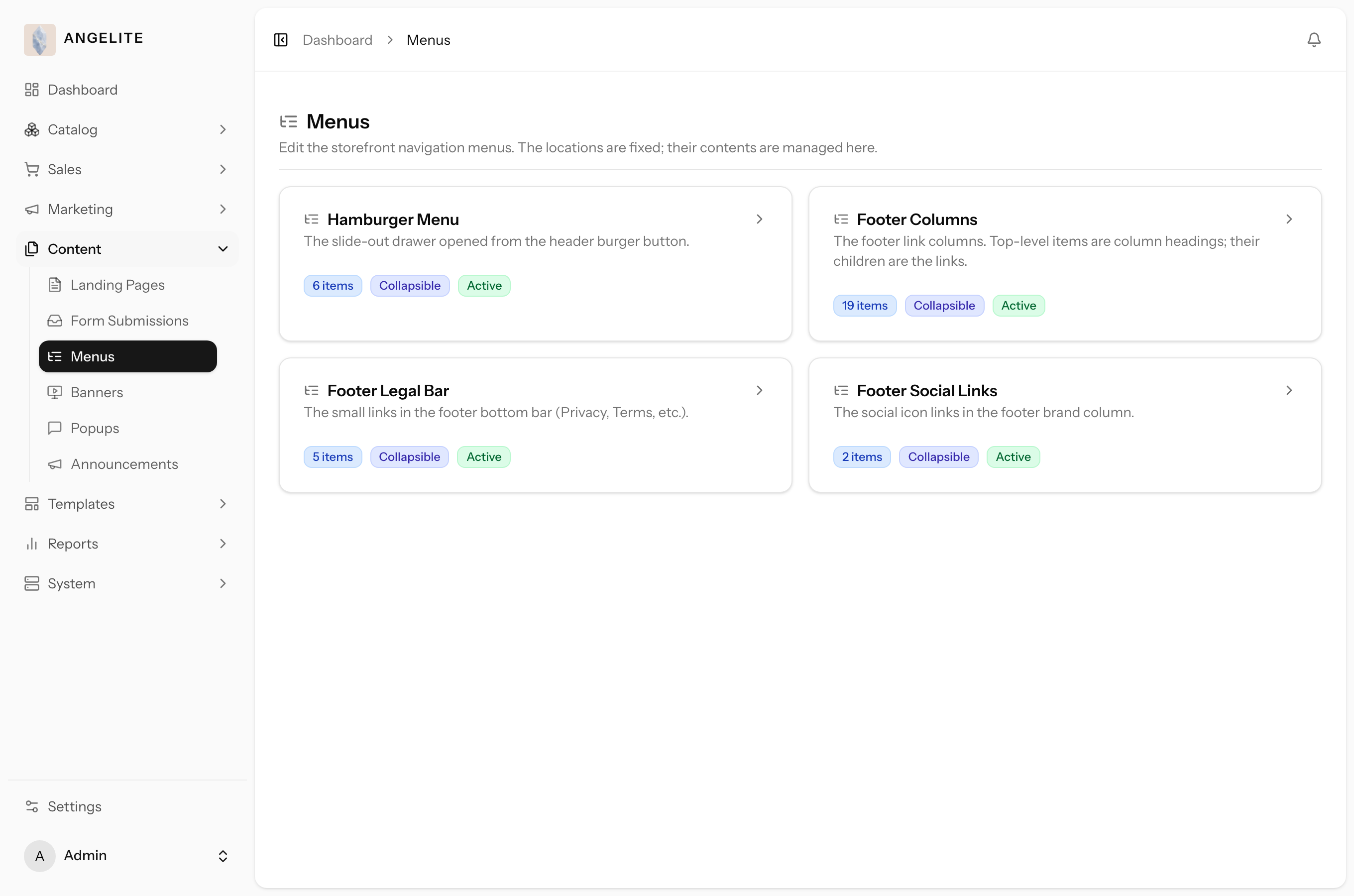
Build your storefront navigation yourself with a drag-and-drop tree editor. Four fixed
menu areas (the header drawer, the footer columns, the footer legal links, and the footer social
icons) are yours to fill and reorder in minutes. A menu item can point to a page, a category, a
collection, a product, a chosen storefront page, or a custom link.
In practice
Imagine you are launching a Ramadan collection drop and want it to appear in the
header menu under "Gifts", alongside your existing Abayas and Kaftans categories, and you also want to
add your Instagram to the footer social icons.
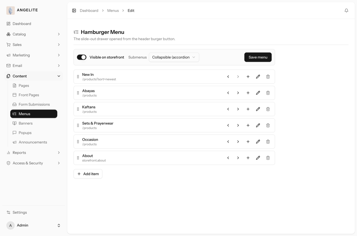
How Angelite handles it: you open Content then Menus and pick the header drawer. You
add a "Gifts" item, then nest the Ramadan collection under it by indenting, and drag it into the order
you want. You label each item in both languages and choose what it links to. You then pick the footer
social area and add an Instagram item with its icon and link, and save. If a linked collection is later
unpublished, its menu item simply drops off on its own, so the menu never leads to a dead end.
How to use it
Open Content → Menus and pick the menu area you want to edit.
Add items and drag them to reorder, or indent them to nest one under another (up to three levels deep).
For each item, choose what it links to and give it a label in each language; you can also add an icon.
Set who sees an item (everyone, guests only, or signed-in shoppers only), then save.
Where: Content → Menus, listing the four storefront menu areas.Where: the menu tree editor, where you add, nest and reorder items.
Self-healing links: if an item points at a page or product that is later
unpublished or removed, the link simply drops off the storefront on its own, so menus never lead to a dead end.